
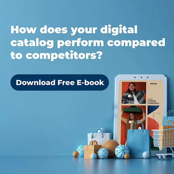
Flyers are a powerful tool for showcasing your products—but are yours optimized for mobile shopping?
With 73% of online sales coming from mobile devices, it’s more important than ever to ensure your flyers are easy to discover, browse, and shop from. The way customers engage with brands online is evolving rapidly, and a well-designed digital flyer can make all the difference in capturing their attention and driving conversions.
One of the most common questions we get from retailers is how to optimize their publications for mobile users. The first step is refining the design to ensure readability and a seamless shopping experience on smaller screens.
To help, we’ve rounded up four mobile-friendly flyers and digital brochures—plus some essential tips on how to make your flyers more effective for mobile browsing.
Supermarket Flyers: Ahold Delhaize
With over a dozen brands operating throughout Europe, Dutch multinational supermarket chain Ahold Delhaize can appeal to online grocery deals shoppers with mobile-optimized flyers.
With a cleaner design, a slimmer page size to better fit mobile devices, and vertical scroll capabilities, browsing and shopping the brand’s latest deals and promotions is quick, easy, and hassle-free.

DIY & home improvement: The Home Depot, Mexico
The Home Depot’s seasonal flyers bring festive inspiration to life with a seamless browsing experience. Designed with a vertical scroll layout, these flyers allow shoppers to explore curated collections effortlessly, mirroring the natural way users navigate on mobile. Instead of flipping through pages, high-quality images are stacked vertically, creating a smooth, continuous flow that keeps users engaged.
Large, vibrant visuals showcase holiday decor in beautifully styled settings, while interactive product tags provide instant access to details and purchasing options. The mobile-optimized design ensures an intuitive shopping journey, making it easier than ever to discover and shop festive essentials—all from the palm of your hand.

Home Improvement: Leroy Merlin
Leroy Merlin’s digital catalog delivers a seamless mobile browsing experience, making it easy for customers to explore the latest home improvement deals. Designed with a smooth vertical scroll, the catalog presents high-quality product images stacked for intuitive navigation.
Each section is clearly segmented, featuring bold headlines and well-spaced layouts that enhance readability. Interactive shopping icons and eye-catching pricing ensure a frictionless shopping journey. At the same time, the mobile-optimized design allows users to quickly discover, compare, and purchase products—all with just a few taps.

Liquor stores: Gall & Gall
Gall & Gall’s digital flyers make it easy for shoppers to browse the latest liquor deals in a sleek, mobile-friendly format. Each page remains uncluttered by featuring just a few products per screen, allowing customers to focus on key promotions without distractions.
The bold red background enhances product visibility, while clear pricing and interactive shopping icons ensure a smooth and engaging browsing experience. This mobile-optimized design simplifies the path from discovery to purchase, making it effortless for customers to explore and shop their favorite drinks.

Tips for optimizing flyers for mobile devices
Today, your digital publications need to be more than just mobile-friendly — they need to be mobile-optimized. Here are our top tips for optimizing your digital publications for mobile:
- From the beginning, remember to design for mobiles first — so use a grid that’s specifically for mobile devices.
- Focus on the content of your publication and less on graphic embellishments.
- Don’t clutter your pages with too much content. Reduce the amount you have per page so that browsers can easily find what they want.
- Nobody likes straining their eyes to read descriptions, so avoid small copy.
- Build vertical scrolling into your flyers so that they emulate modern web apps; this improves readability by making it easy to scan and scroll.
- Include rich media in your publications, such as GIFs, video, and high-quality still images with motion.
Optimizing your flyers and brochures for mobile aligns your content with how your customers are likely to be browsing. If the above sounds like something you need help with, we offer a mobile optimization service. Feel free to contact us.